Artist Monica Rohan knows how to create a mood.
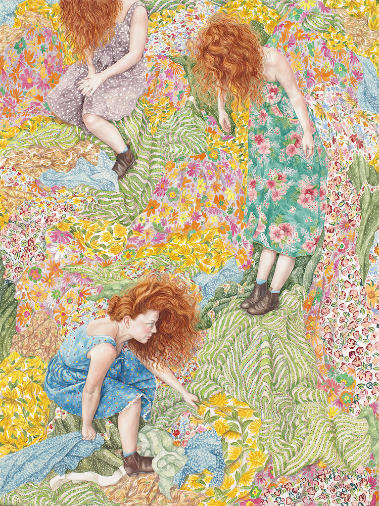

Artist Monica Rohan knows how to create a mood.
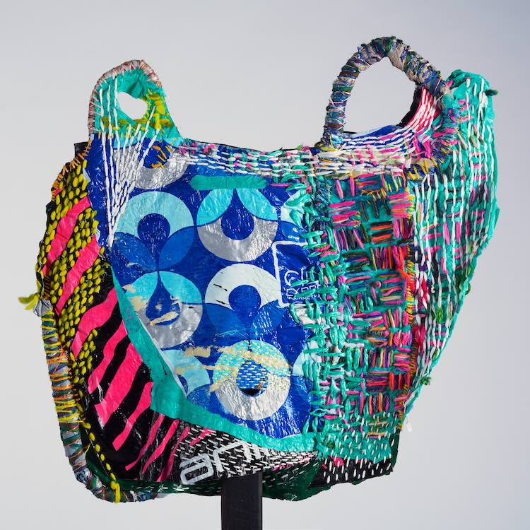
Artist Josh Blackwell reconstitutes the plastic bag—a symbol of the affront to fighting climate change—into a work of art.
Maybe you don’t want to live in a winter wonderland, but Vanessa Bowman will have you wishing that you did. Her landscape oil paintings add an idyllic and tranquil touch to white weather scenes. Among the snow on the ground are…
Susanna Bauer transforms dried leaves into small sculptures and works of fiber art. Using a combination of crochet and stitching techniques, she pierces each brittle blade to embellish or reconfigure the leaf structure. The results are exquisite and showcase Susanna’s incredible…
Maybe you don’t have a green thumb and all your plants eventually wilt. You know what? That’s okay. Because thanks to the mushroom felt crafts by Close Call Studio, you can still have something life-like in your home. Amanda Adams,…
Almost a year to the day, I wrote about Joanne Ho’s exquisite swimming paintings. From a bird’s eye view, she introduced us to a bevy of anonymous characters who were so tiny they looked like ants among the grandiose landscape. Well,…
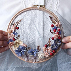
I’ve featured a fair share of hoop art on Brown Paper Bag, and it generally involves embroidery thread—but not for crafter Olga Prinku. Rather, she’s reimagined this popular format with her floral wreath weavings. Using a tulle (or mesh) fabric, Olga places…
If you’re in the midst of winter, Becky Blair’s landscape paintings are a beautiful escape from dreary skies and frigid temperatures. Fusing realism with abstraction, she layers colors, textures, drawing, and printing to create imagery that are like vivid dreams.…
Once again, Kirsten Sims has captured an incredible energy in her paintings that recall the spontaneity of pencil sketches. Her latest series was created for the Turbine Art Fair in Johannesburg, and they feature vibrant outdoor and indoor scenes that act as a yin and…
I’ve written here before about my penchant for 100 days projects, and artist Samantha Russo has recently completed one that’s full of color and pattern—plus, it’s all contained in her sketchbook. Page after page, she uses paint, markers, and pastels…