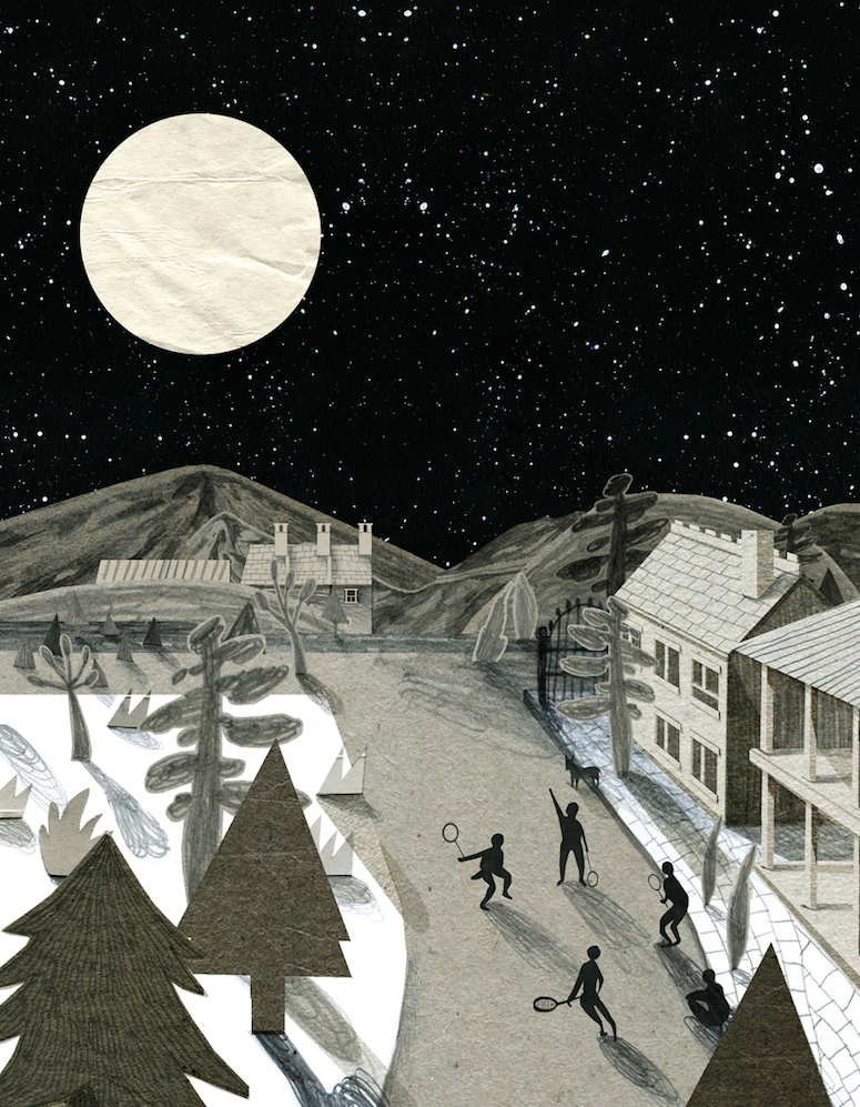
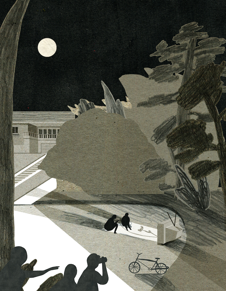
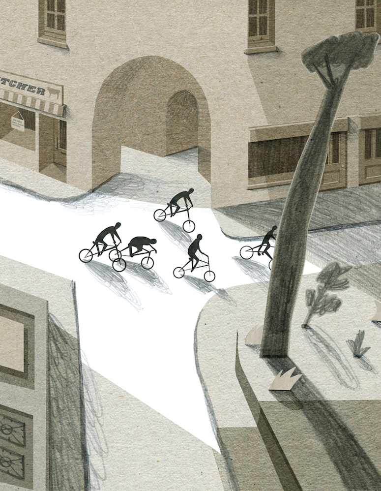
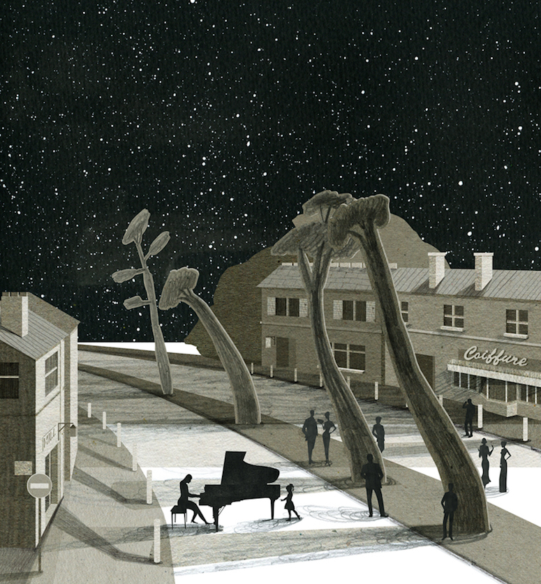
Since yesterday featured some collaged houses, why not continue the trend? Nancy Liang is an Australian-based illustrator whose proves my theory that kraft paper is the best thing to draw on. I love how graphite looks on it, and Liang’s gestural marks add some serious visual interest. Especially when you look at her squiggly, out-of-control shadows.
In addition to drawing, I’m also digging the color palette. Or, rather, lack thereof — there’s a rich combination of neutral papers that illustrate the strange (and not so strange) activities that we do under a bright moon.
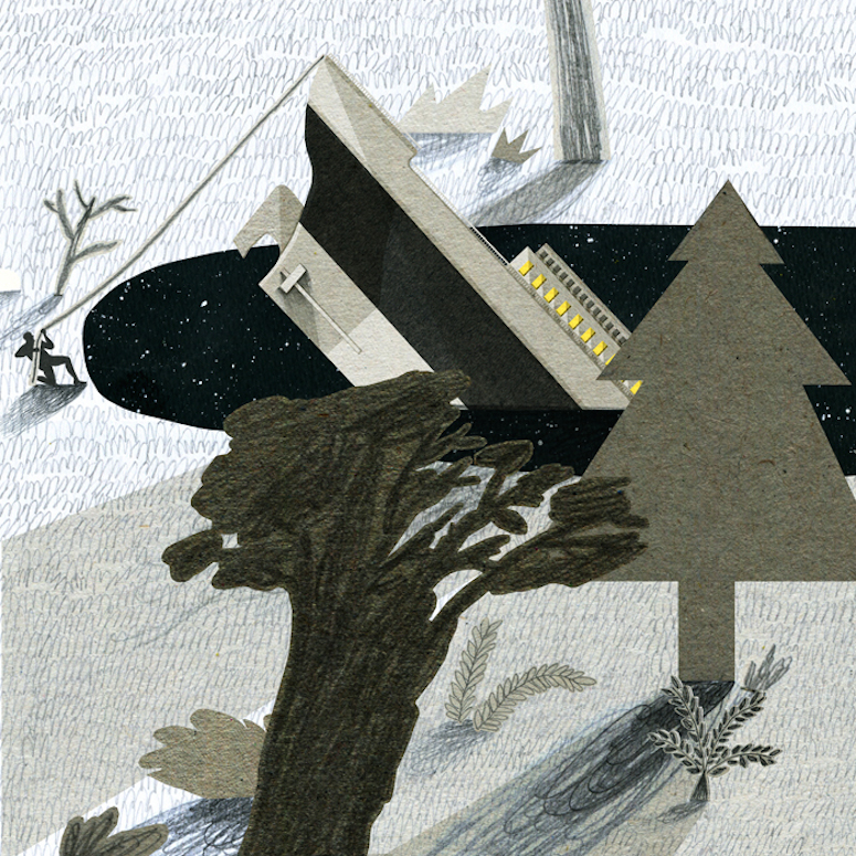
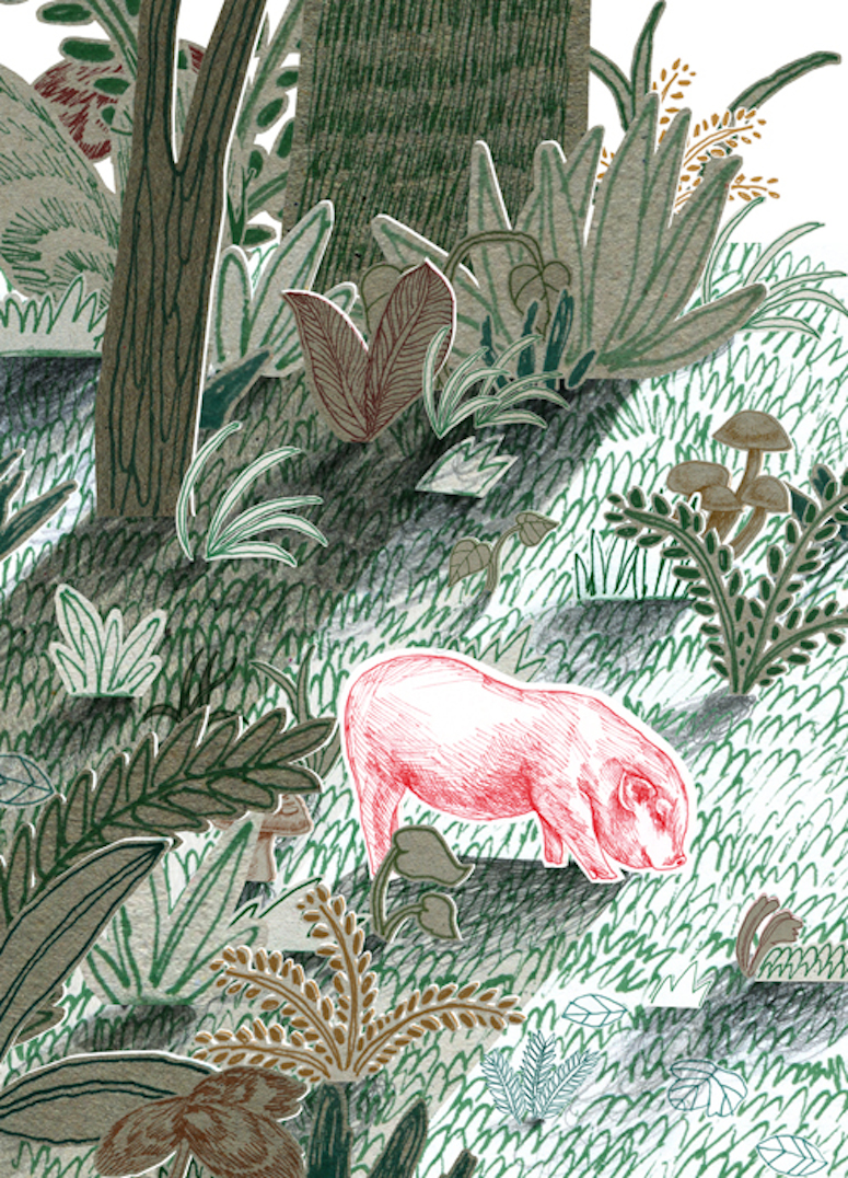
And finally, a colorful illustration by Liang: