There's so much to see!

There's so much to see!

If you're a literature lover, check these out!
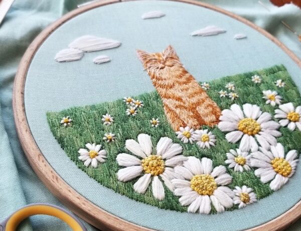
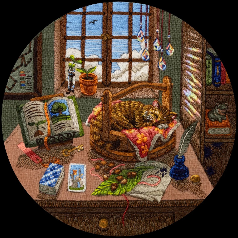
Did you know that Saturday is Caturday? This day is for our feline friends in all their bean-cleaning,…
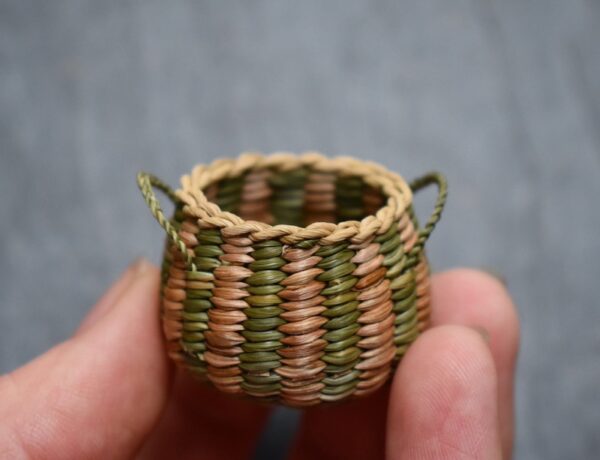
These incredible woven baskets fit in the palm of your hand!
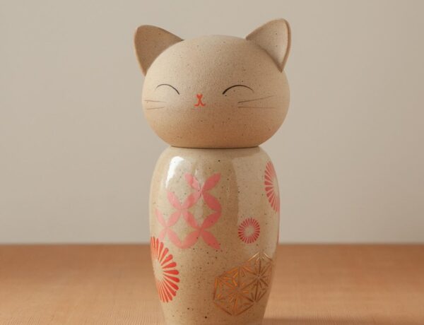
The cat kokeshi doll she made is one of my prized possessions.
Here's my list of five supplies that I use regularly. To me, they're the best hand embroidery supplies!