You might not consider yourself a particularly "creative" person, but trust me—there's no wrong way to collage.
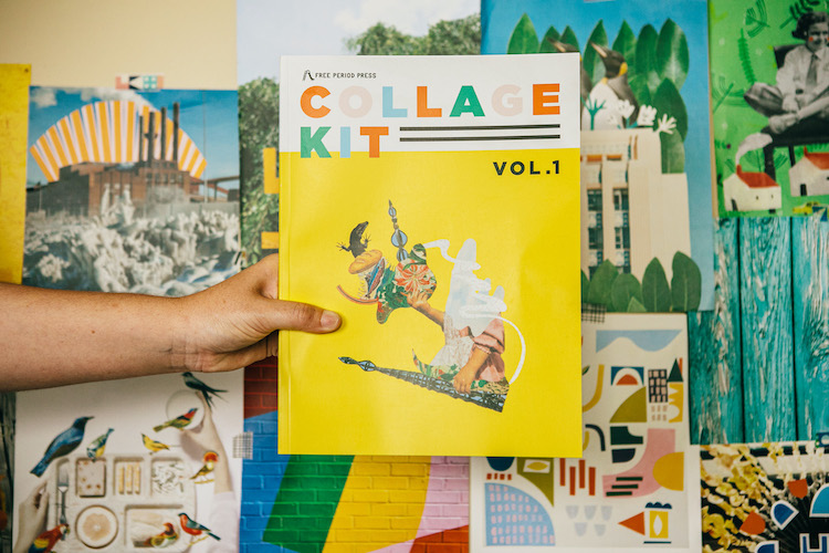

You might not consider yourself a particularly "creative" person, but trust me—there's no wrong way to collage.
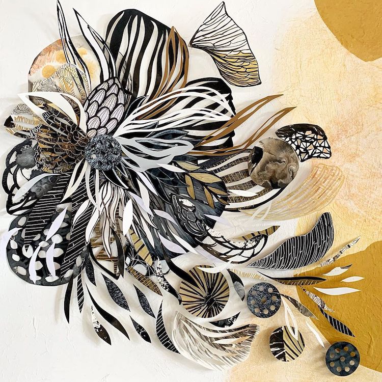
Artist Maggie Ramirez Burns creates collage art that rides the fine line between order and chaos.
Using the scissors as her paintbrush, Rocío Fernández Fuks engages in paper collage making of storybook scenes. Her latest series is called Forest & Ocean, and it depicts three places—two treehouses and a meeting underwater.
When it comes to trying something new, art-wise, I’m firmly in the camp that if you want to experiment with a technique or expand part of your studio then you should just do it. Don’t wait around for the perfect…
Inspired by the surrealists and mid-century children’s books, illustrator Martin Haake creates collages bustling with life. The stylized compositions utilize a bevy of textures, including the written word and carefree brush strokes. While they might class, Martin masterfully places the…
In April of 2018, illustrator Dawn M. Cardona embarked on the ambitious endeavor known as the 100 Day Project. For over three months, she pledged to create a different paper square each day and completed it on July 22, 2018. She ended up…
There are many ways to “paint” that don’t use a paintbrush. Illustrator Clover Robin uses cut paper collage as a way to compose her images. To do this, she paints sheets of paper with different colors and textures and then…
I’ve never been one for crochet (I’ve tried—I’m really bad at it), so the freeform crochet of Tuija Heikkinen really captivate me. She has a unique take on collage, opting to craft many separate pieces that are then assembled into…
The idea of “play” is important in an artistic practice. Having the time to follow creative whims—to try things that both succeed and fail—will help you develop your visual language and hone your process. Julie Hamilton uses her Instagram to do…
Illustrator Eric Carle was one of my earliest memories of illustrated books. You know his work—he’s the creator of The Very Hungry Caterpillar and other titles. I especially loved his technical approach. His collage illustrations are rich in color and texture. It’s…