
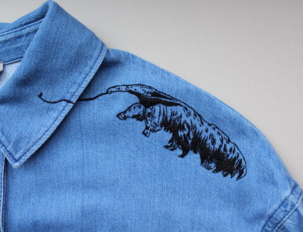
How an Embroiderer Honors the National Parks, One Stitch at a Time
"It takes some time to feel out a craft or art form that you feel drawn to."

"It takes some time to feel out a craft or art form that you feel drawn to."
I don't write in here as often as I'd like. But you know where I publish new content…
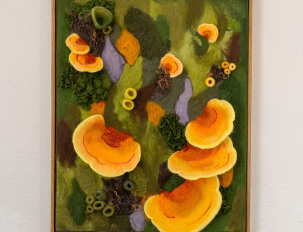
I chatted with artist Amy Reader about her needle-felted fiber art that's inspired by the forest floor.
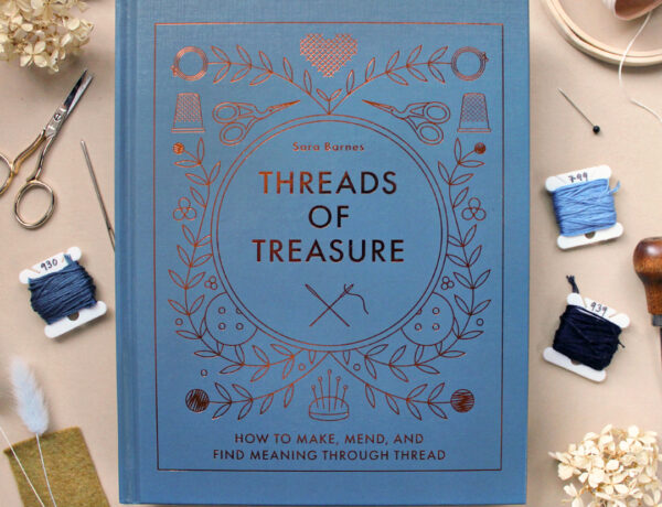
I wrote a book! Titled 'Threads of Treasure: how to make, mend, and find meaning through thread,' it's…
Make threadpainting and stumpwork magic in Megan Zaniweski's new book.
Textile artist Jessie Mordine Young is embarking on her most demanding project yet. For every day of 2023,…
Need a gift for your favorite lady friend on Galentine's Day? I've got you covered.
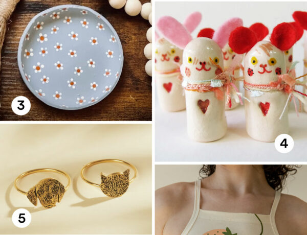
Happy Friday! All of the links to shop these products are in the post.
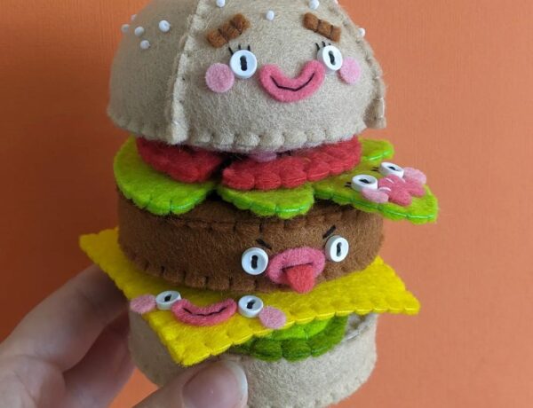
Sarah of Mega Felt creates one-of-a-kind plush sculptures featuring burgers and ice cream.
In the fall of 2022, I was scrolling through Poshmark and saw a cute denim dress that I…