Are your walls looking a little bare? Prints are an easy way to add some color to a room and give it some personality.
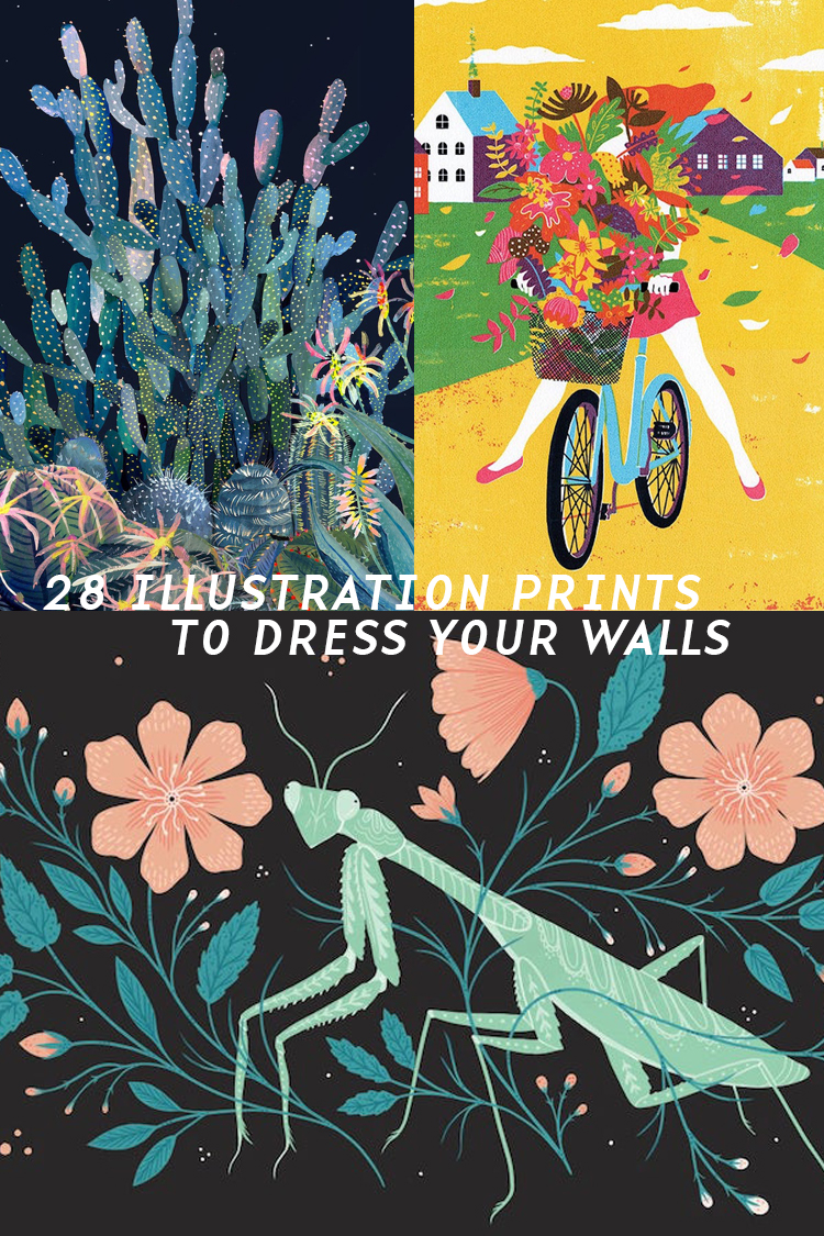

Are your walls looking a little bare? Prints are an easy way to add some color to a room and give it some personality.
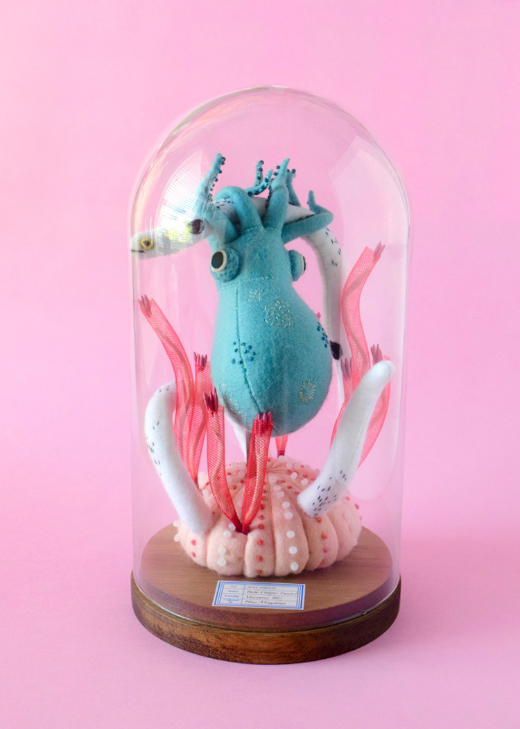
For years, I've admired the "slow crafting" of Hiné Mizushima. Her soft sculptures are often presented like scientific specimens but with a fantastical twist.
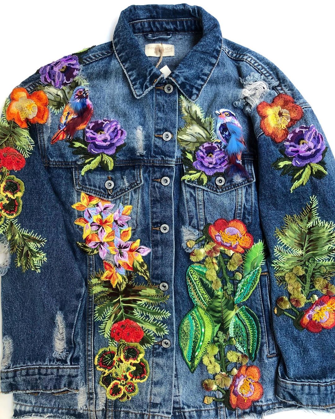
Denim jackets were always in style, but they seem to be having a major moment thanks to the revival of 90s fashion.
It’s said that we can infer the personality of others simply by what they own and how tidy (or untidy) their space is. Since that’s the case, there’s much to be gleaned from still life art. The objects and their…
New Years is my favorite holiday. After all, you get to dress up and toast that this upcoming trip around the sun will definitely be better than the last. It’s also a great time for reflection and goal setting. Maybe you want to…
The open water is full of contradictions. It can be a site of rebirth or intense distress; the same place that delivers an idyllic calm can become instantly tempestuous. Because of its conflicting nature, everyone’s relationship to the water is…
Artist Hiné Mizushima continually wows me with her craft creations. Combining fiber techniques such as needle felting, crochet, and embroidery, she produces fantastical works that are driven by strong character design and (/or) stories.
Illustrator Mlle Hipolyte is no stranger to Brown Paper Bag. For the past few years, I’ve featured her intricate cut paper art and noticed this great progression in her work. She started by making colorful animal masks and transitioned to mural-sized creations…
Citing “worn out brushes” as one of her favorite tools, Sofia Moore paints scenes that fuse abstracted landscapes with elegant figures and animals. The imaginary places burst with color, texture, and gorgeous shape design that builds rich, dense illustrations.
Having a good journal is like having a trusty companion. I have so many small art journals and keep every one of them; I can’t bear to part with my scribbled (and often indecipherable) notes or doodles. Artist Lily Moon…