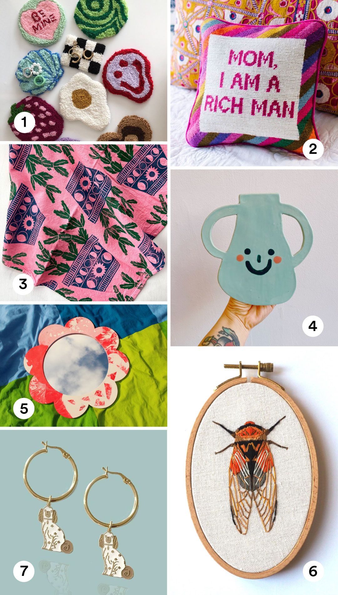
Happy Friday! All of the links to shop these products are in the post.

Happy Friday! All of the links to shop these products are in the post.
Happy Friday! All of the links to shop these products are in the post.
Happy Friday! All of the links to shop these products are in the post.
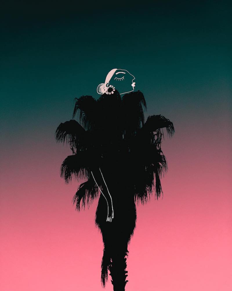
Koketit, aka Shira Barzilay, creatively incorporates the landscape into her art.
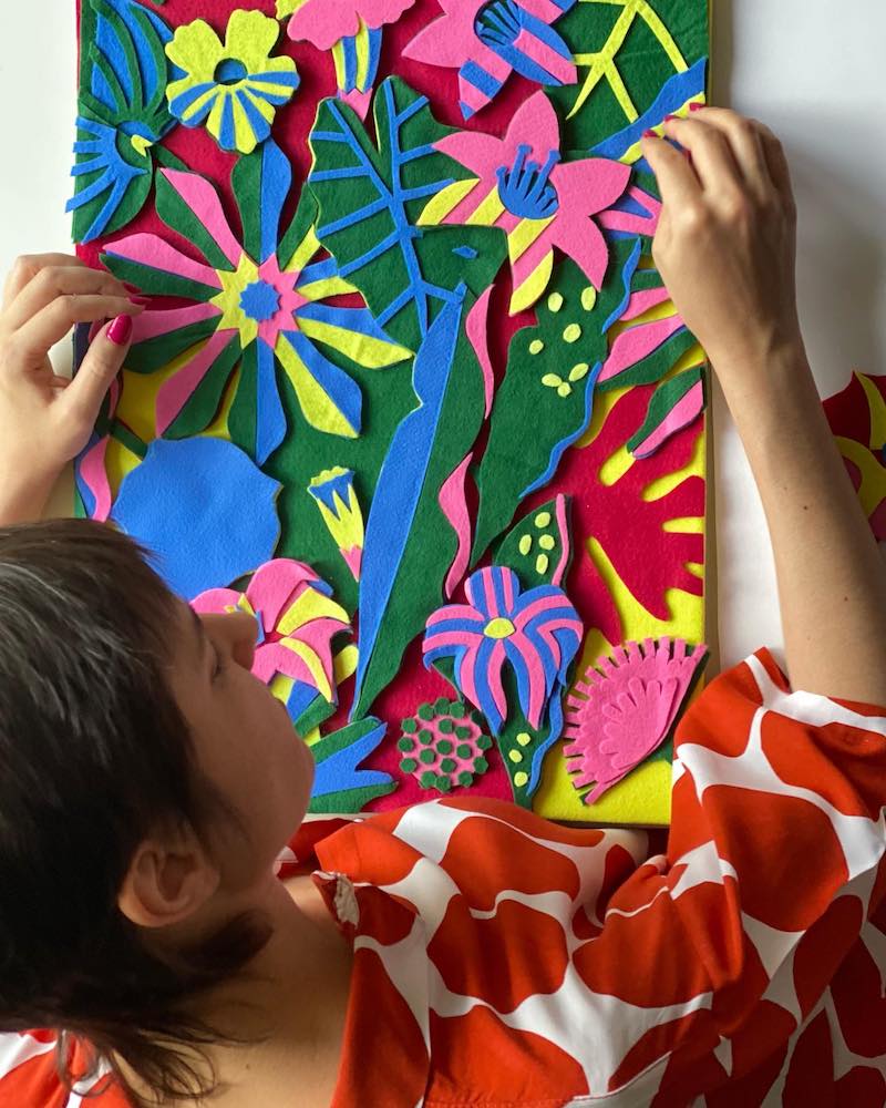
How do you feel about felt art?
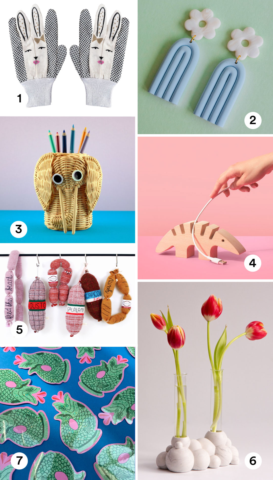
Happy Friday! All of the links to shop for these products are in the post.
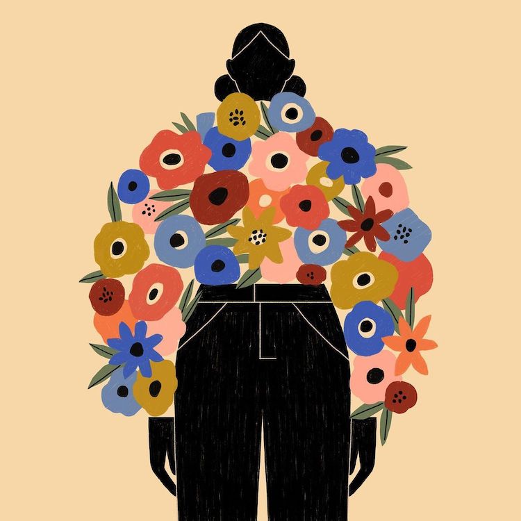
Illustrator Abbey Lossing creates a wardrobe that I'd like to wear.
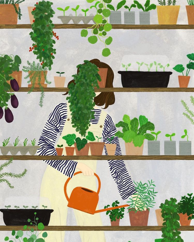
Remember to "water on Wednesday" with these beautiful illustrations featuring dutiful plant parents.
Happy Friday! All of the links to shop for these products are in the post.

Shae, aka SHE IS THIS, creates colorful illustrations that are fully in bloom.