Ah, the joys of visiting somewhere new.

Ah, the joys of visiting somewhere new.
Artist Meg Lionel Murphy paints giantesses.
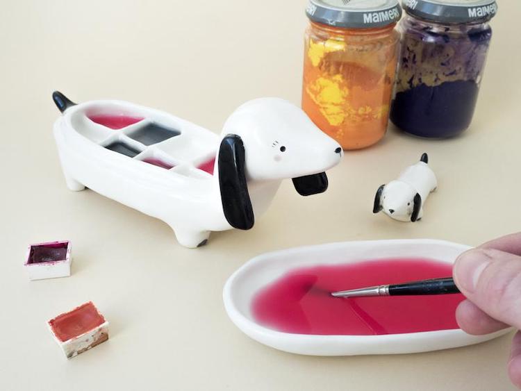
Tramai Ceramics creates animal-shaped palettes whose faces act as a cover for your wet paint.
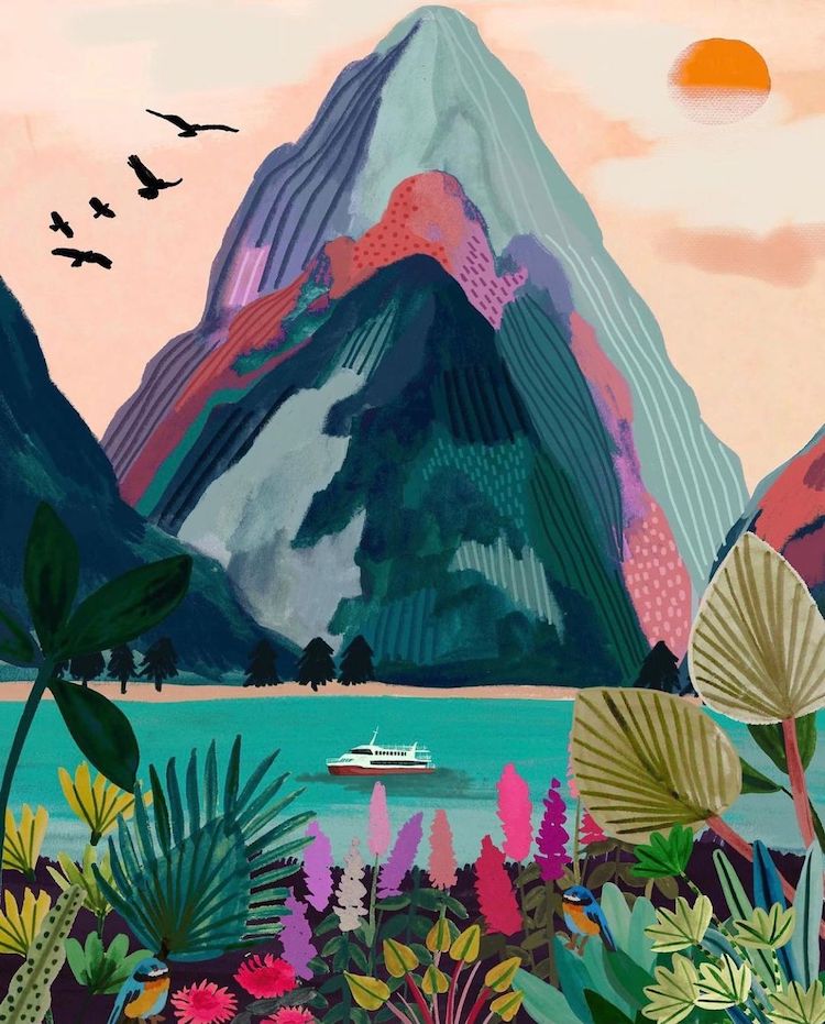
Joanne Ho, aka Helo Birdie, creates travel paintings of places that are sure to give you wanderlust.
Last week, I had the pleasure of previewing Betsy Walton’s solo show, Psychic Landscapes, at the ZINC Contemporary in Seattle’s Pioneer Square. (I’ve long been a fan of Betsy’s work—she was even in a show I curated a few years…
Artist Hilary Pecis depicts the present in still life paintings. Through carefully crafted arrangements, she seemingly illuminates what’s right in front of her. A stack of books, a selection of condiments, and bouquets of flowers are all subjects in her…
The illustrations of Sofia Moore are no stranger to Brown Paper Bag. Calling herself an “illustrator of imaginary things,” Sofia paints ghost-like creatures who occupy luscious landscapes of color and drybrush texture.
Michelle Morin paints idyllic landscape art that will ignite your sense of wanderlust. Her works, devoid of people, showcase the beauty of the wild. Bunches of brambles, tall grasses, and fields of flowers rule her compositions and create intricate relationships…
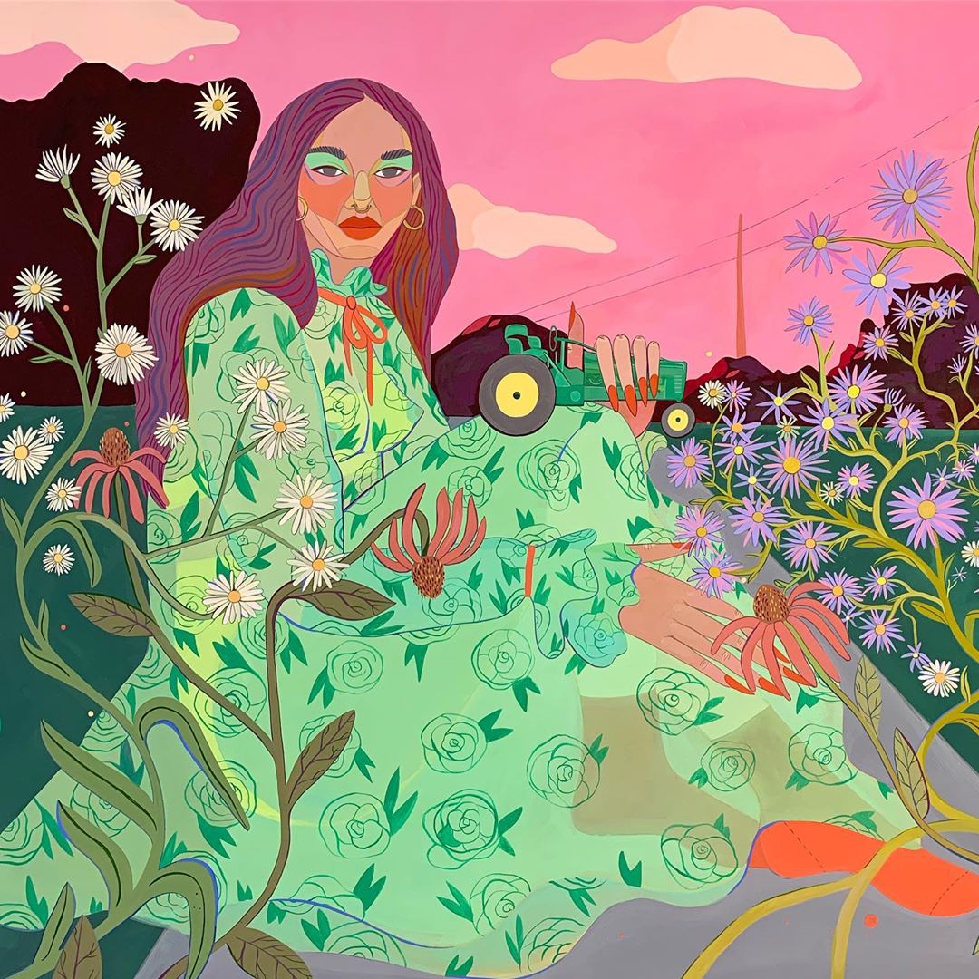
Escape into the colorful, pattern mixing world of Roeqiya Fris. The Dutch-Egyptian illustrator cites “Arab culture, nature, and fashion” as inspiration for her works of visual splendor, which juxtapose repeating motifs every chance they get. The images depict women who…
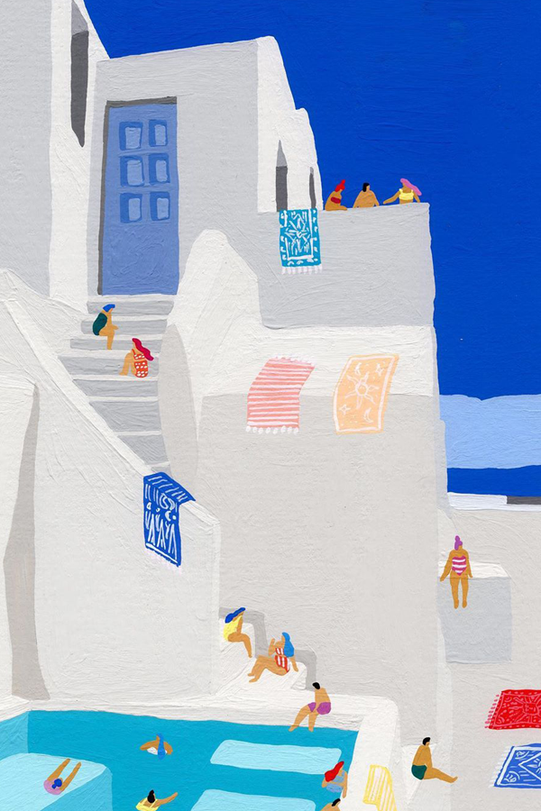
It can be easy to feel cooped up at home, but the landscape illustrations of Lylean Lee offer some form of momentary escape. The painted images showcase grandiose settings where small (sometimes faceless) characters explore and take advantage of the…