

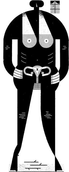
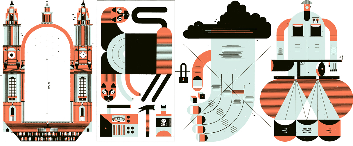
Illustrator Raymond Biesinger writes that his illustrations are a “curious mix of minimalism and maximalism,” and I couldn’t agree more. While his work is flush with large, graphic shapes and solid colors, there’s a lot to his work. Not only conceptually, but visually. He packs his images with shapes both small and large, and simple patterns like dots and rows of lines.
Raymond’s illustrations accompany a lot of articles about business. While that could be boring, he makes beautiful images that spice up concepts like “changing retail techniques” (out of context, what does even mean?!).
All images via his website and Etsy.







1 Comment
Alex Desjardins
December 19, 2013 at 12:23 amI’m a really big fan of his work!
Happy to see him on this blog which I love as well 🙂